

July 2021
Creating the perfect Image Component
With the right optimizations, you can save ~80% on every image you load.
If you can lower your load time by just 4 seconds, your probability for a page bounce could
decrease by as much as 90%1.
This should be reason enough to take a closer look at modern image loading capabilities.
What then are the steps that we can take in order for us to load the best possible image? To decrease the required image size, we could:
- use a smaller, modern image format if supported, e.g. AVIF
- download the image that is closest to the rendered size in the DOM
- use a fitting image for different display densities
- show a preview while loading the full-size image to improve perceived performance
- let the browser have the final say on which image gets loaded. It could for example load a smaller image when the network is particularly slow or if the user has a data saver mode enabled
This is what our finished component will look like while loading on a slow connection (drag the slider to see the change):

How can we achieve this? The first step is using the correct HTML element.
Using srcset and sizes
The traditional way of using an <img> tag clearly won't suffice. So what are the alternatives?
HTML offers us a way to define multiple different versions of an image in a single element: using the srcset attribute combined with the sizes attribute. In the srcset we can define multiple images and tell the browser the width of each, and using sizes we can tell the browser the approximate size of the image in the viewport in a CSS like syntax so the image can start downloading without needing to layout the whole page first.
An <img> tag for an image embedded in a blogpost could look like this:
<img
srcset="
/imgs/ocean.jpg?width=1120 1120w,
/imgs/ocean.jpg?width=840 840w,
/imgs/ocean.jpg?width=560 560w,
/imgs/ocean.jpg?width=340 340w
"
sizes="(min-width: 610px) 40rem,
calc(100vw - 2.4rem)"
src="/imgs/ocean.jpg?width=560"
width="560px"
height="234px"
alt="wild ocean with a clear sky"
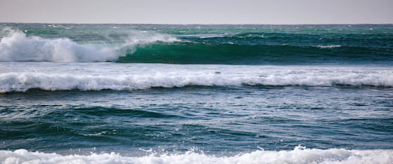
/>This tells the browser that the image has a size of calc(100vw - 2.4rem), as an image spans the full width minus the padding, and at a window width of 610px, the image has the maximum size of the blogpost container, 40rem(~560px). We also add the src attribute as a fallback for browsers that don't support srcset, as well as a width and height, so the browser can reserve space for the image before it's loaded, avoiding layout shift. If you want, you can open the inspector and see what size your browser loads the following image2 at:
Alright, unto our next problem: different image formats. How can we give the browser different image formats using this? We can't. At least not directly in the <img> tag.
For this we have two options. We can request a jpg from the server, where our browser automatically sets the "Accepts" header to a list of all supported image formats, to which the server responds with the image in the most recent supported format and sets the "Content-Type" accordingly. This approach relies on the browser sending the correct header and accepting a response in a different format than requested. Also, if the user now saves this file, it will be stored with the wrong extension. But sites like The Guardian are using this approach, so it might work great in practice.
The <picture> tag
The second option is using the <picture> tag. It supports multiple <source> elements within, each being able to define a different format. With two image formats, AVIF an JPG, it could look like this:
<picture>
  <source
    type="image/avif"
    srcset="
      /imgs/ocean.avif?width=1120 1120w,
      /imgs/ocean.avif?width=840   840w,
      /imgs/ocean.avif?width=560   560w,
      /imgs/ocean.avif?width=340   340w
    "
    sizes="(min-width: 610px) 40rem,
           calc(100vw - 2.4rem)"
  />
  <source
    type="image/jpeg"
    srcset="
      /imgs/ocean.jpg?width=1120 1120w,
      /imgs/ocean.jpg?width=840   840w,
      /imgs/ocean.jpg?width=560   560w,
      /imgs/ocean.jpg?width=340   340w
    "
    sizes="(min-width: 610px) 40rem,
           calc(100vw - 2.4rem)"
  />
  <img
    src="/imgs/ocean.jpg?width=560"
    width="560px"
    height="234px"
    alt="wild ocean with a clear sky"
  />
</picture>
You can see that the <source> tag looks a lot like our previous image tag, just that we now set the type as an attribute. We also add an <img> tag as a fallback, which would be ignored by every browser that supports the <picture> tag. Here is how all this looks like, feel free to take a look in the inspector:

There is a lot of repetition, so this lends itself to two things: automatic generation and gzip/brotli compression, so the transmitted size will be quite small even though there might be lots of markup.
Generating HTML and handling LQIP with React
If we want to use this in a real application, it would be way to cumbersome to write all of this by hand every time we want to use an image.
The following will assume that we are loading the image in a single page application that receives the information about the image from an API, in form of a JSON object which could look like this:
{
  imgId: "89d3502a067d",
  width: 560,
  height: 234,
  lqip: "/9j/2wBDAAYEBQYFBAYGBQYHBwYIChAKCgkJC..."
}
The LQIP is a base64 encoded jpg buffer, that we can use directly in our src-attribute if we append data:image/jpeg;base64, to it. This is not the most optimized approach and we can definitely save some bandwidth here, e.g. by using a tool like blurhash, you can switch to this in your implementation if you want.
Just generating the HTML from this in a React component is rather simple, here's an example:
interface ImageProps {
  id: string
  width: number
  height: number
  sizes: string[]
  widths: number[]
  alt?: string
}

const Image: React.FunctionComponent<ImageProps> = ({
  id,
  width,
  height,
  sizes,
  widths,
  alt,
}) => {
  const url = "https://api.example.com/images"
  const aspectRatio = width / height

  const srcset = (format: string) =>
    widths
      .map(scaledWidth => {
        const scaledHeight = Math.round(scaledWidth / aspectRatio)
        return `${url}/${id}.${format}?width=${scaledWidth}&height=${scaledHeight} ${scaledWidth}w`
      })
      .join(",")

  return (
    <div className="wrapper">
      <picture>
        {[
          ["image/avif", "avif"],
          ["image/webp", "webp"],
          ["image/jpeg", "jpg"],
        ].map(format => (
          <source
            key={format[0]}
            type={format[0]}
            sizes={sizes.join(",")}
            srcSet={srcset(format[1])}
          />
        ))}
        <img src={`${url}/${id}.jpg`} alt={alt} width={width} height={height} />
      </picture>
    </div>
  )
}
If you're implementing this yourself, you probably have to change the url schema in the srcset generation.
If you want to have the image automatically resize to fit the parent width, you can target the img inside the picture element:
.wrapper picture img {
  width: 100%;
  height: auto;
}
In the end, there should be no difference between the generated <picture> element from our react component, but take a look yourself:
Handling the LQIP
To decrease perceived loading times, we want to show the user a low resolution placeholder of our image while the real image is loading in the background.
We can achieve this by at first rendering the image with its srcset pointing to the placeholder and storing the real srcset in the data-srcset attribute. Then we replace the srcset with the real srcset immediatly.
Normally we would assume that if we do this, the browser will show our placeholder for a fraction of a second, and then switch to an empty image while the real one is loading, and then show the full image. But the browser is actually quite clever. It shows the last complete image as long as the new one is not fully loaded, so we never see the blank image.
To set all srcsets in the picture element, we will access it using the useRef hook:
const pictureRef = useRef<HTMLPictureElement>(null)and link it to the picture element. We will also set the data-srcset and srcset accordingly:
<picture ref={pictureRef}>
  {[
    ["image/avif", "avif"],
    ["image/webp", "webp"],
    ["image/jpeg", "jpg"],
  ].map(format => (
    <source
      key={format[0]}
      srcSet={`data:image/jpeg;base64,${lqip}`}
      type={format[0]}
      sizes={sizes.join(",")}
      data-srcset={srcset(format[1])}
    />
  ))}
  <img src={`${url}/${id}.jpg`} alt={alt} width={width} height={height} />
</picture>
We will set the srcset using a useEffect Hook, in which we iterate through all <source> elements and set each srcset individually:
useEffect(() => {
  if (!pictureRef.current) return

  pictureRef.current.childNodes.forEach(childNode => {
    if (childNode instanceof HTMLSourceElement) {
      childNode.srcset = childNode.dataset.srcset || ""
    }
  })
}, [])
After applying all of this, our image loading looks like this under a simulated slow 3G connection:
Or if you want to try it out yourself, you can try reloading the page and see the effect in action:
This is already pretty good, but there are still some issues we can fix.
How to make the loading actually look good?
You might notice that the blur doesn't look as good as a regular blurred image. This is because the browser applies a faster but less accurate blurring algorithm. If we want to have a nice, smooth gaussian blur, we need to add this ourselves with some CSS. Although you have to be cautions when doing so, as blurring too many large images on a page might affect the performance, especially on mobile devices.
To apply CSS depending on whether the image has loaded already, we can attach an onLoad event listener to the <img> element and set the data-loaded attribute on the picture element:
function onLoadFinished() {
  if (!pictureRef.current) return
  pictureRef.current.dataset.loading = "false"
}
We will add the eventListener in another useEffect hook, which needs to execute after the hook that sets the correct srcset. Otherwise the onLoadFinished will get triggered by the placeholder loading. We also return a function to remove the event listener on unmount to prevent memory leaks:
// this needs to happen after the srcset gets switched, otherwise
// the load LQIP will trigger the function early
useEffect(() => {
  setTimeout(() => {
    if (!pictureRef.current) return
    const imgEl = pictureRef.current.querySelector("img")

    if (!imgEl) return

    imgEl.addEventListener("load", onLoadFinished)
    return () => imgEl.removeEventListener("load", onLoadFinished)
  }, 6000)
}, [])
The CSS part seems trivial, but isn't. The first instinct is to add backdrop-filter: blur(...) to the img element, but this leaves the image with blurry edges that bleed into the surrounding content. If we want clean, crisp edges, we have to use a helper element, e.g. the ::after of the <picture> element and set a regular filter: blur(...) on it:
.wrapper {
  position: relative;

  picture {
    &::after {
      content: "";
      height: 100%;
      width: 100%;
      position: absolute;
      top: 0;
      left: 0;
      backdrop-filter: blur(12px);
      opacity: 1;
      transition: opacity 0.2s ease-in;
      pointer-events: none;
    }

    &[data-loading="false"]::after {
      opacity: 0;
    }
  }
}
After all this, we finally have a the finished image component with LQIP and responsive image sizes. Here's the demo:
You can take a look at the real thing. I've added an artificial delay so you can see the effect more easily:
Finishing thoughts
So this is it, an optimized image component with an LQIP placeholder.
Event though there's definetly still room for further optimization, this post should show you how to implement a really good image implementation yourself.
There are, however, still some shortcomings that could make this not ideal for your usecase:
- this approach requires JavaScript, which means that the image loading won't happen until execution finishes. This wouldn't impact performance at all in SPA's on consecutive page loads, but could seriously impact the first load time of a page
- The function to replace the img src triggers immediately. This could be replaced with an Intersection Observer that doesn't start the image loading until the image is close to the viewport
Although these are valid concerns, they mostly won't apply if you are loading images in your SPA where routing is done clientside and the user has already downloaded all scripts.
Thank you for reading all of this, if you found a mistake or just want to reach out, you can dm me on twitter or send me an email at [email protected].